Here at ChartsView we are all about learning and eduction.
In this section, you will be able to find our range of great trading video's. Please note to access our full range of videos you need to be registered as a member on our site.
Using a step by step approach they show you exactly how to conduct technical analysis, hopefully the visual aspect will help you to gain a better understanding.

The video's we have on offer are:
• How to draw trend lines.
• How to draw Fibonacci retracements.
• How to draw supports.
• How to draw resistance.
• How to draw gaps.
• How to use the 1-hour trading system.
• How to use the inside bar trading system.
• How to use the 123 low system.
Here at ChartsView we will regularly update the learning section with more great learning material and videos for your attention so please monitor this section for updates.
This system looks for inside day using bar charts on daily time frame or candlestick charts,
This system requires 3 time scales to be used:
• The first time scale is the 4-hour chart - confirmation.
• The second time scale is 1-hour chart - confirmation.
• The third time scale is the 5-min chart - The signal.
Each if these time scales has a 60 SMA (simple moving average)attached to it.
If on the first time scale (4-hour chart) the price is above the 60 SMA, then you would look to buy.
You then would move to the second time scale(1-hour chart). If this is also above the 60 SMA you have another time scale that lines up, again you will be looking to buy.
(if this was not above the 60 SMA then you would stop and wait for this to go above).
You then move on to the third time scale(5-min chart) which gives you your entry level. This also has to be above the 60 SMA.
The buy signal comes once the previous high on this time frame gets broken, that's your buy signal.
Basically all the time frames must show the price above the 60 SMA or else there will be no signal created.
This system has been created by Andy Perry Captain Currency if you need any more information.
This system works on the basis that the first hour of trading sets the tone for the rest of the trading day.
Point and figure charts are distinctive in terms of their analysis and construction. Unlike other charts, time does not play a big factor.
They are plotted on a grid and are made up of 0's and X's. O's are used when the price moves down and X's are used when they go up. Each box on the grid will be used for 0's or X's.
Prices movements are plotted on the vertical axis(y axis) and direction changes are plotted on the horizontal axis(x-axis), prices are scaled on the vertical axis. A box represents the number of points that you have selected.
When the price goes up then you would mark it with an X but only when the market price rises completely through the box then you would place an X in the box.
So every full box size will generate an X. For 0's to be generated the price must reverse a minimum of 1 box (1 box reversal) but most commonly used is a 3 box reversal, which requires the correction of 3 boxes before the 0's can be plotted. This will help filter out most of the noise so time is not really a factor.
So once in the trend the next X or 0 will only need 1 box move to register on the chart where as a reversal will require 3 box move in the opposite direction to register. That's why its called a 3 box reversal.
You can change the setting to what you want. You can use a 5 box reversal but remember this will take a lot longer to see the movements on the chart. So the usual preference is the 3 box reversal and this is the most common one.
Another way to change the setting will be the price move itself e.g.
• 1 * 3 box reversal. for every point move. Reversal require 3 points
• 2 * 3 box reversal. For every 2 points move. Reversal require 6 points
• 3 * 3 box reversal. For every 3 point move. Reversal require 9 points
• 5 * 3 box reversal. For every 5 points move. Reversal require 15 points
• 10 * 3 box reversal. For every 10 points move. Reversal require 30 points
• 50 * 3 box reversal. For every 50 points move. Reversal require 150 points
• 100 * 3 box reversal. For every 100 points move. Reversal require 300 points
The following table will help you to decide what box sizes to use, you should really try and experiment with different box sizes to suit your share.
|
price |
Suggested Box size |
|
10 -50 |
1 |
|
50 -250 |
3 |
|
250-500 |
5 |
|
500-1500 |
10 |
|
1500-5000 |
50 |
|
5000+ |
100 and above |
As can be seen from the chart below. When prices reverse, the X or the 0 is not in the same column.
|
18 |
|
|
|
|
|
|
|
|
|
|
|
|
|
|
|
|
|
17 |
|
|
|
|
|
|
|
|
|
|
|
|
|
x |
|
x |
|
16 |
|
|
|
|
|
|
|
|
|
|
|
x |
|
x |
o |
x |
|
15 |
|
|
|
|
|
|
|
|
|
|
|
x |
o |
x |
o |
x |
|
14 |
|
|
|
|
|
|
|
|
|
|
|
x |
o |
x |
o |
x |
|
13 |
|
|
|
|
|
|
|
|
|
|
|
x |
o |
x |
o |
x |
|
12 |
|
|
|
|
|
|
|
|
|
|
|
x |
o |
x |
o |
x |
|
11 |
|
|
|
|
|
|
|
|
|
|
|
x |
o |
|
o |
|
|
10 |
|
|
|
|
|
x |
|
x |
|
x |
|
x |
|
|
|
|
|
9 |
|
|
|
|
|
x |
o |
x |
o |
x |
o |
x |
|
|
|
|
|
8 |
|
|
|
|
|
x |
o |
x |
o |
x |
o |
x |
|
|
|
|
|
7 |
|
|
|
|
|
x |
o |
x |
o |
x |
o |
x |
|
|
|
|
|
6 |
|
X |
|
x |
|
x |
o |
|
o |
|
o |
|
|
|
|
|
|
5 |
|
X |
o |
x |
o |
x |
|
|
|
|
|
|
|
|
|
|
|
4 |
|
X |
o |
x |
o |
x |
|
|
|
|
|
|
|
|
|
|
|
3 |
|
X |
o |
|
o |
|
|
|
|
|
|
|
|
|
|
|
|
2 |
|
X |
|
|
|
|
|
|
|
|
|
|
|
|
|
|
|
1 |
|
X |
|
|
|
|
|
|
|
|
|
|
|
|
|
|
Every reversal will start in a new column and it must reverse by 3 to generate a reversal. For example:
If you are plotting a 5 by 3 (5*3) 5=box size and the 3=reversal.
If the latest box to be filled is 300 and the price rises to 305 then you would place another x in the 305 box. If then the price rises to 309 then you would ignore this as it has not moved by 5 points.
If the price suddenly moves to 323 then you would place an x up to the 320 mark(310,315,320). You would discard the 323 price as it has not moved by 5 clear points.
If the price then turns down and moves to 313 you would still not plot any 0 as it has not corrected by 3 box sizes.
For a new set of 0's to be plotted the price must move 5*3=15 points. So the current high is 320 – 15 points so 305 will be the level before a new set of 0's can be plotted. Every box is equal to 5 points.
So once 305 is hit then you would plot an 0 in 315, 310 and 305. So hence a new column of 0's.
All the above is based on intraday moves. Most point and figure charts are done on intraday.
There are different time frames you can use with point and figure. End of day point and figure is plotted exactly like the intraday point and figure but only the closing price is used. So it misses a lot of the intraday moves, a bit like the line charts where all the important levels will be missed.
See chart below
Please click on picture below to get a larger image

This method uses the whole days moves so you use a lot more data. It totally ignores the closing prices. This method has the advantage that you can read the supports and resistances levels much better and clearer.
See chart below
Please click on picture below to get a larger image

• Trend lines are drawn from an extreme bottom or top with a 45-degree angle attached to it.
• Bullish trend lines are drawn from a known low at 45-degrees pointing upwards.
• Bearish trend lines are drawn from a known high at 45-degrees pointing downwards.
| Double Top Breakout | ||
|---|---|---|
| X | ||
| X | X | |
| X | O | X |
| X | O | X |
| X | O | |
| X | ||
← Buy
| Double Bottom Breakout | ||
|---|---|---|
| O | X | O |
| O | X | O |
| O | X | O |
| O | O | |
| O | ||
← Sell
| Triple Bottom Breakout | ||||
|---|---|---|---|---|
| O | X | X | ||
| O | X | O | X | O |
| O | X | O | X | O |
| O | X | O | X | O |
| O | O | O | ||
| O | ||||
← Sell
| Triple Top Breakout | ||||
|---|---|---|---|---|
| X | ||||
| X | X | X | ||
| X | O | X | O | X |
| X | O | X | O | X |
| X | O | X |
O | |
| X | O | |||
← Buy
| Upside Triangle | ||||
|---|---|---|---|---|
| X | ||||
| X | X | X | ||
| X | O | X | O | X |
| X | O | X | O | X |
| X | O | X | O | |
| X | O | X | ||
| X | O | |||
| X | ||||
← Buy
| Downside Triangle | ||||
|---|---|---|---|---|
| O | ||||
| O | X | |||
| O | X | O | ||
| O | X | O | X | |
| O | X | O | X | O |
| O | X | O | X |
O |
| O | O | O | ||
|
O |
||||
← Sell
| Symmetrical Triangle | |||||
|---|---|---|---|---|---|
| O | |||||
| O | X | ||||
| O | X | O | X | ||
| O | X | O | X | X | |
| O | X | O | X | O | X |
| O | X | O | X | O | X |
| O | X | O | X | O | |
| O | X | O | X | ||
| O | X | O | |||
| O | X | ||||
| O | |||||
← Buy
| Symmetrical Triangle | |||||
|---|---|---|---|---|---|
| O | |||||
| O | X | ||||
| O | X | O | |||
| O | X | O | X | ||
| O | X | O | X | O | |
| O | X | O | X | O | |
| O | X | O | X | O | |
| O | X | O | X | O |
|
| O | X | O | O | ||
| O | X | O | |||
| O | |||||
← Sell
Price Targets
Point and figure charts have the ability to project targets, there are 2 ways to count these either using the horizontal or the vertical count.
| 8 | X | ||||
| 7 | X | X | |||
| 6 | X | O | X | ||
| 5 | X | X | O | X | |
| 4 | X | O | X | O | |
| 3 | X | O | X | ||
| 2 | X | O | X | ||
| 1 | X | O |
← Target 18
| X | ||||||||
| X | ||||||||
| X | X | X | X | |||||
| X | O | X | O | X | O | X | ||
| X | O | X | O | X | O | X | X | |
| X | O | X | O | O | X | O | X | |
| X | O | X | O | X | O | X | ||
| X | O | O | O | |||||
| X |
There are many different signals on the point and figure charts and so you do really need to read about them first. The above is just an introduction to point and figure charting.
• From the charts you can see almost the entire trading history on one page.
• Easy to see buy and sell signals.
• Trend is clear to see.
• Point and figure charts have targets.
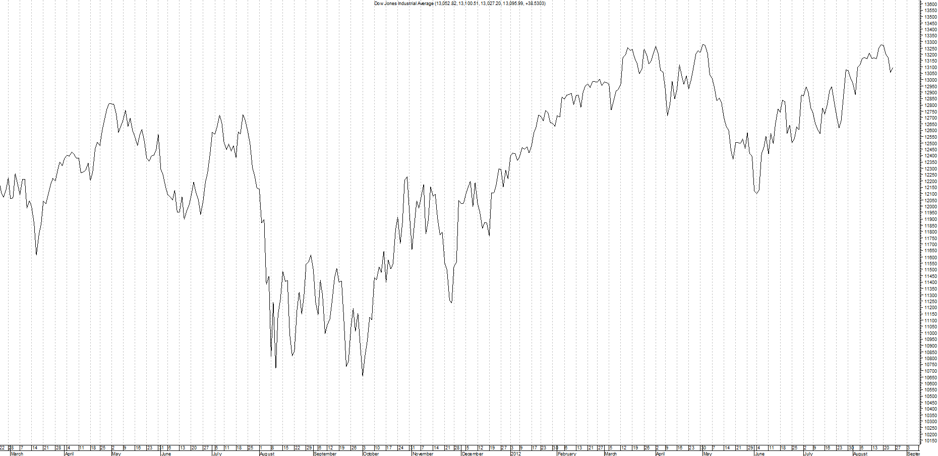
Line charts are created by a single line joined together by the end of day closing price.
Same is true of all time frames, so if you were to plot the weekly line chart then you would use the closing price at the end of the trading week.
Chart is provided by MetaStock and is an example of a line chart
Please click on picture below to get a larger image