RSI - A deeper look inside
in ChartsView Blog:- Font size: Larger Smaller
- Hits: 16199
- 4 Comments
- Subscribe to this entry
- Bookmark
Hey guys and gals,
I'm writing this blog for 2 main reasons -
1. to test the new, easier to use Blog interface, and
2. to go through some random charts with the aim of looking at the RSI more closely - also to find out the correlation between the RSI and EWT - if indeed there is a strong links
In order to do this with no bias other than the assumptions I already have, I am literally going to pick out random charts, aswell as different timelines in order to see if there is any pattern that can be identified.
** Note - some or most of you will probably already know or understand any correlation or patterns identified with RSI/Divergence/EWT - but I feel this could be a beneficial exercise for me regardless, and no harm can come of it I imagine. I am also testing out the blogging software as previously discussed.
So - to start off, let me define that I already have a bias in terms with how I feel an RSI performs in the case of reversals etc. I think this can be directly linked to Elliot Wave Theory. In the case of a standard EWT 1 through 5 waves, I would expect the RSI (which measures the relative strength of particular moves) to perform as follows:
--------------------------
Definitions:
HH = Higher High
HL = Higher Low
LH = Lower High
LL = Lower Low
--------------------------
Wave 1 - RSI peak
Wave 2 - RSI HL
Wave 3 (most powerful move) - RSI HH
Wave 4 - RSI HL
Wave 5 - RSI LH
Wave 5, although is higher in price action - is actually a weaker move than the previous 3rd wave, which is the theory behind a weaker RSI move.
Within each wave is also smaller intermediate waves - so when a larger price move peak is reached, it is my opinion that you often see divergence at the top to indicate the peak.
One issue I had early in my trading is often I had identified what I believed to be a peak, where there was one diverging RSI peak, then price action would beat that high with ANOTHER diverging RSI peak. This is when I started noticing that it happened quie frequently.
This is why I want to write this blog (regardless of the writing quality - or lack of more to the point!)
I see this as a worthwhile exercise to put something publicly, so that I cannot kid myself on if the conclusion diverges away from the bias opinion I have.
So - onto the structure quickly. We will use high volume charts that we all have charted - 2 Forex, 2 Index', and 2 Shares:
Eur/USD
USD/JPY (one I haven't really charted
Dow
FTSE
GKP - again not one I have really charted, but I know others have
AAPL - Just for the sh*t of it since I haven't charted either
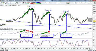
Since it is late - and I'm tired - I will maybe just run through the EUR/USD chart tonight and see what patterns I can identify. In order to this, I will first identify all major peaks, and then look at the behaviour of the RSI leading up to that peak. I will also only look at uptrending moves. Not out of any bias - purely out of simplicity. I believe the RSI will behave the same regardless - but it is definitely something I will be looking at at a later stage regardless of my thoughts.
So EUR/USD - Weekly
Next blog up we will look up some closer up examples of the Eur/USD chart - as these peaks also have intermediate peaks that we can maybe look closer into.
Apologies for what seems like only half a blog - I was meant to do this over the weekend but time ran away from me hence the rushed fashion of the post. I am now heading to bed - hopefully I will get something a bit more substantial for blog 2.
On a side note - the blog is very easy to write, and all the tools are available for more seasoned bloggers - give it a try!


Thanks gclark25 for the blog.
looking forward to part 2.
Thanks mate