Stock charts can look intimidating at first glance — a tangle of lines, bars, and colours that seem to require a degree in mathematics to interpret. But the fundamentals of chart reading are surprisingly accessible. Once you understand a handful of core concepts, you'll be able to look at any stock chart and extract meaningful information about price trends, momentum, and potential turning points.
Why Bother Reading Stock Charts?
Before we get into the mechanics, it's worth understanding why charts matter at all. Fundamental analysis tells you what a company is worth based on its financials — earnings, revenue, debt, and so on. Technical analysis, which is what chart reading falls under, tells you something different: what other investors are actually doing with the stock right now.
Price charts capture the collective behaviour of every buyer and seller in the market. They reveal patterns of supply and demand, sentiment shifts, and momentum that fundamental analysis alone can miss. Many successful UK investors use both approaches together — fundamentals to decide what to buy, and charts to decide when to buy or sell it.
You don't need to become a full-time technical analyst. Even a basic understanding of chart reading can help you avoid buying at peaks, identify good entry points, and spot warning signs that a stock might be heading for trouble. Every stock on ChartsView comes with interactive TradingView charts where you can practise these concepts for free.
Understanding Chart Types
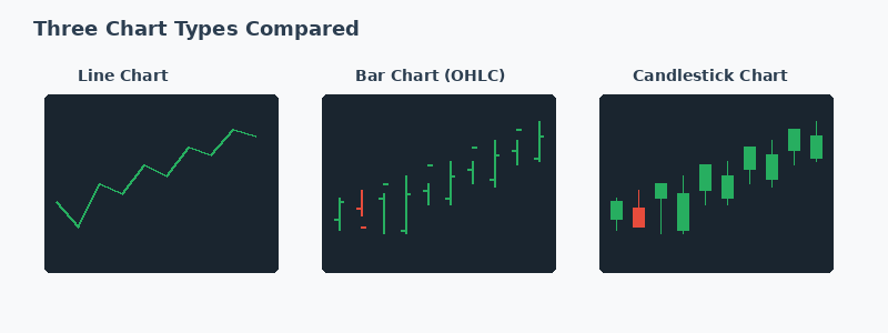
There are three main chart types you'll encounter, and each presents price data differently.
Line Charts
The simplest chart type. A line chart plots the closing price of a stock at each time interval and connects them with a single line. It gives you a clean view of the overall trend but hides important detail about what happened during each trading session. Line charts are useful for getting a quick sense of direction — is the stock trending up, down, or sideways?
Bar Charts (OHLC)
Bar charts show four pieces of data for each time period: the open, high, low, and close (OHLC). Each bar is a vertical line showing the high and low, with small horizontal ticks marking the open (left) and close (right). This gives you much more information than a line chart — you can see the full range of trading activity in each session.
Candlestick Charts
Candlestick charts display the same OHLC data as bar charts but in a more visual format. The "body" of the candle shows the range between the open and close, while thin "wicks" above and below show the high and low. A green (or white) candle means the price closed higher than it opened. A red (or black) candle means it closed lower.
Candlestick charts are by far the most popular among traders and investors. They're easier to read at a glance and form recognisable patterns that can signal potential price movements. When you look at charts on ChartsView stock pages, you'll be using candlestick charts by default.
Reading the Basics: Price and Time
Every stock chart has two axes. The horizontal axis shows time — this might be minutes, hours, days, weeks, or months depending on the timeframe you've selected. The vertical axis shows price. The chart plots how the stock's price has changed over the selected time period.
Choosing the right timeframe depends on your investment horizon. If you're a long-term investor holding stocks for years, look at weekly or monthly charts to see the big picture. If you're making shorter-term decisions, daily charts are more appropriate. Avoid the temptation to look at very short timeframes (minutes or hours) unless you're actively day trading — they create noise that can lead to poor decisions.
Timeframe Guide
Long-term investors (years): Use weekly and monthly charts. Swing traders (weeks to months): Use daily charts. Short-term traders (days): Use hourly and 4-hour charts. Always check the longer timeframe first to understand the bigger trend before zooming in.
Support and Resistance
Support and resistance are two of the most fundamental concepts in chart reading, and they're surprisingly intuitive once you understand the logic behind them.
Support
A support level is a price at which a stock has historically stopped falling and bounced back up. Think of it as a floor. When a stock approaches a support level, buyers tend to step in because they see value at that price. The more times a stock has bounced off a particular support level, the stronger that level is considered to be.
Resistance
Resistance is the opposite — a price level where a stock has historically stopped rising and pulled back. It acts as a ceiling. Sellers tend to take profits at resistance levels, creating selling pressure that pushes the price back down.
Why do these levels work? Because thousands of investors are looking at the same charts and acting on the same levels. It becomes partly self-fulfilling — if enough people expect a stock to bounce at a certain price, they buy there, and the stock does bounce. This is why chart reading has practical value even if you're sceptical about technical analysis as a predictive tool.
Practical Example
Imagine you're looking at Vodafone's chart on the ChartsView stock page. You notice the price has bounced off 70p three times over the past six months but has struggled to break above 85p. This tells you 70p is a support level and 85p is resistance. If you're considering buying, entering near the 70p support gives you a better risk-reward ratio than buying at 82p near resistance.
Volume: The Confirmation Tool
Volume measures how many shares were traded during each time period. It typically appears as a bar chart beneath the main price chart. Volume is crucial because it tells you the strength of conviction behind a price move.
A price increase accompanied by high volume suggests strong buying interest — lots of investors are committing capital. A price increase on low volume is less convincing and may not sustain itself. Similarly, a price drop on heavy volume is more significant than one on light volume.
Watch for volume spikes — sudden surges in trading activity. These often coincide with company announcements, earnings reports, or significant news. A volume spike combined with a break through support or resistance is a particularly strong signal. You can see volume data on every stock chart within ChartsView.
Moving Averages: Smoothing the Noise
Daily price movements can be erratic, making it hard to see the underlying trend. Moving averages solve this by calculating the average closing price over a set number of days and plotting it as a smooth line on the chart.
Simple Moving Average (SMA)
The most common moving averages are the 50-day SMA and the 200-day SMA. The 50-day average smooths out roughly two months of data, giving you the medium-term trend. The 200-day average smooths nearly a year of data, showing the long-term trend.
When the price is above its moving average, the trend is generally considered up. When below, the trend is down. Many investors use the 200-day moving average as a simple rule: only buy stocks that are trading above their 200-day SMA, as this confirms a long-term uptrend.
The Golden Cross and Death Cross
When the 50-day SMA crosses above the 200-day SMA, it's called a "golden cross" — traditionally seen as a bullish signal. When the 50-day crosses below the 200-day, it's a "death cross" — bearish. These signals aren't foolproof, but they provide a useful framework for understanding trend changes.
You can overlay moving averages on any chart within the ChartsView stock pages using the TradingView indicators menu. Start with the 50-day and 200-day SMAs, and watch how the price interacts with them over time.
Common Chart Patterns to Recognise
Certain price patterns appear repeatedly across different stocks and timeframes. While no pattern guarantees a particular outcome, recognising them gives you context about what might happen next.
Uptrend and Downtrend
An uptrend is a series of higher highs and higher lows. Draw a line connecting the lows — this is the trend line. As long as the price stays above this line, the uptrend is intact. A downtrend is the opposite: lower highs and lower lows. Connect the highs to see the descending trend line.
Double Top and Double Bottom
A double top occurs when a stock rises to a certain level twice and fails to break through both times. It resembles the letter "M" and often signals a reversal from an uptrend to a downtrend. A double bottom (shaped like a "W") is the bullish equivalent — the stock falls to a level twice, holds, and reverses upward.
Head and Shoulders
This pattern consists of three peaks — the middle one (the "head") is the highest, with two lower peaks (the "shoulders") on either side. It often signals the end of an uptrend. The inverse head and shoulders pattern signals a potential reversal from a downtrend to an uptrend.
Pattern Trading Warning
Chart patterns are suggestive, not definitive. They fail regularly, and relying on them in isolation is risky. Always use patterns alongside other analysis — fundamentals, volume, moving averages, and news. Use the ChartsView screener to ensure any stock you're interested in also has strong fundamentals before making decisions based on chart patterns alone.
Putting It All Together
Now that you understand the building blocks, here's a practical approach for reading any stock chart:
Start by zooming out to a weekly or monthly chart to understand the big picture trend. Is the stock in a long-term uptrend, downtrend, or range? Then switch to a daily chart to examine the current situation more closely. Identify key support and resistance levels — where has the price bounced or stalled before?
Add the 50-day and 200-day moving averages. Is the stock above or below them? Is the short-term average above or below the long-term one? Check the volume bars — is recent activity confirming the price direction? Finally, look for any recognisable patterns that might suggest what comes next.
This process takes just a few minutes per stock. Combine it with the fundamental research you can do using the screener and comparison tool, and you've got a comprehensive approach to evaluating any investment opportunity.
Common Beginner Mistakes
Over-Analysing Short Timeframes
New chart readers often zoom into minute-by-minute data and try to find patterns in what is essentially random noise. Stick to daily charts or longer until you're experienced. The longer the timeframe, the more reliable the signals.
Seeing Patterns Everywhere
Once you learn about chart patterns, you'll start seeing them everywhere — including in random data where they don't exist. Be selective and look for clear, well-defined patterns rather than forcing ambiguous formations to fit a narrative.
Ignoring the Bigger Trend
A bullish pattern on a daily chart means very little if the weekly chart shows a strong downtrend. Always check the bigger picture first. The trend is your friend — don't fight it.
Using Charts Without Fundamentals
Charts tell you what's happening with the price, but not why. A stock might be breaking above resistance because of a genuinely transformative development, or because of short-term hype. Use the daily briefing and community feed to understand the story behind the chart moves.
Start Practising Today
Chart reading is a skill that improves with practice. Start by picking a few stocks you're interested in and studying their charts daily. Note what you observe, make predictions about what might happen next, and see how accurate you are over time. You'll be surprised how quickly your chart-reading ability develops.
Every stock on ChartsView comes with full interactive TradingView charts — you can add indicators, draw trend lines, switch timeframes, and practise all the concepts covered in this guide. The more charts you study, the more natural the reading becomes.
Explore Interactive Stock Charts
Every stock on ChartsView includes full TradingView charts with indicators, drawing tools, and multiple timeframes. Start reading charts today — completely free.
Browse Stock Charts