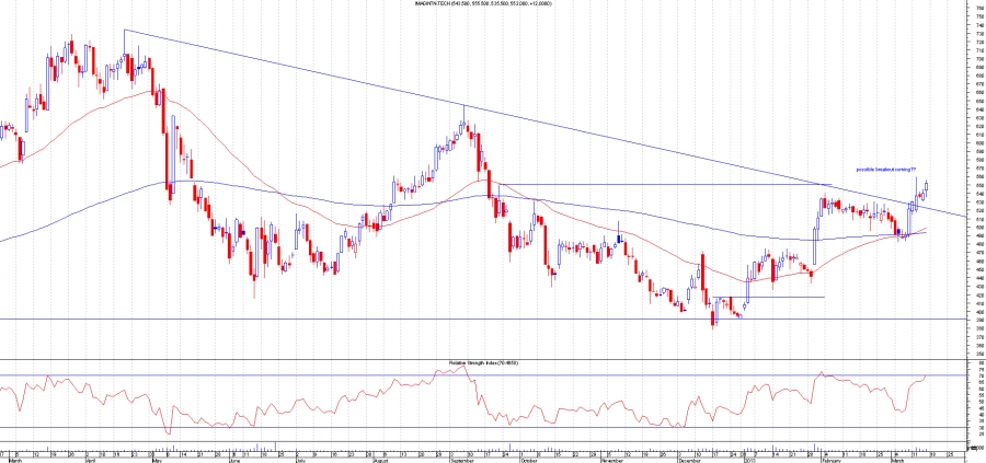
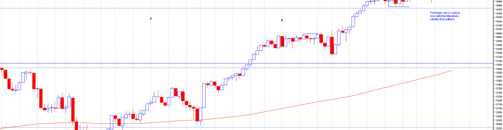
Marubozu candlestick pattern on the dow. This is quite a rare pattern on the dow jones industrial.This shows that the bears are in charge and bigger falls maybe about to come.Go away in april and come back in october may be true this year.A good entry based on this pattern is if the price comes half way up the Marubozu in this case to 14731(this is th 50% point of the Marubuzu) then short with stops above preferably.Caution on new longs as this could be the signal for a top. Obviously if the price goes back above the Marubozu then its void.
Marubozu candle has a long black body(red in my chart) and has no upper or lower shadows. This pattern indicates that the sellers are in charge and is pretty bearish pattern.
Ive noticed a lot of the time prices come back half way up a Marubozu and...
Continue reading
SXX
Click to enlarge chart of SXX
AQP
Click to Enlarge Chart of AQP
QFI
Click to Enlarge Chart of QFI
AEX
Click to Enlarge Chart of AEX
POG
Click to Enlarge Chart of POG
HOIL
Click to Enlarge Chart of Hoil
XTA
Click to Enlarge Chart of XTA
GPK
Click to Enlarge Chart of GPK
GLEN
Click to Enlarge Chart of GLEN
BARC
Click to Enlarge Chart of Barc
WZR
Click to Enlarge Chart of WZR
BLVN
Click to Enlarge Chart of BLVN
pj -my views , catch you next week...
Continue reading
Evening Guys and Gals,So on this entry I think we will take a closer look at the RSI behaviour in a smaller timescale on the EurUsd and see if we can notice any pattern.The first chart will show peaks in an uptrend - and show examples of where it would be a good spot to have went short - and the subsequent behaviour at these levels.The 2nd chart will do the same - except look at peaks in a down trend. Will be interesting to see if the behaviour is the same.So, without further delay - chart 1, this is just the first random period of 3+ peaks I could find on the 1H chart:
From this chart - we can see 3 of the 4 peaks identified have clear bearish divergence. 2 of the 4 were on the 3rd RSI peak, with the other being less clear.1 thing I...
Continue reading
Hey guys and gals,I'm writing this blog for 2 main reasons -
1. to test the new, easier to use Blog interface, and
2. to go through some random charts with the aim of looking at the RSI more closely - also to find out the correlation between the RSI and EWT - if indeed there is a strong links In order to do this with no bias other than the assumptions I already have, I am literally going to pick out random charts, aswell as different timelines in order to see if there is any pattern that can be identified.** Note - some or most of you will probably already know or understand any correlation or patterns identified with RSI/Divergence/EWT - but I feel this could be a beneficial exercise for me regardless, and no harm can come of it I imagine. I am also testing out the blogging software as...
Continue reading
Interesting charts update
Last weeks interesting chart section had a very good week, with many of them breaking out and moving higher. A few of them were false breakouts but still should have profited from the inital thrust. I'm not putting all the charts up but only the ones that have moved higher. There were 12 shares to watch out for and 6 of them moved higher so should have been a good week for some who took the trades.
Starting with ABF.L( Associated British Foods)
This share broke out of the triangle and continuation pattern.
Before the breakout:
After the breakout:
BG.L (BG Group)
This broke out nicely and now is re-testing the breakout point. If this goes back below the new support then chances are it would be a false breakout. Profits should have been taken on this share.
Before the breakout:
After the breakout:
BRBY.L(Burberry Group PLC)...
Continue reading


